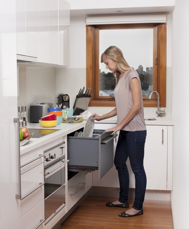
 Image via: Stuff That I Bought I attended a CDECA (Canadian Decorators' Association) event yesterday, which was about not about appliances but happened to be hosted in the gorgeous Fisher & Paykel showroom in Mississauga. I was smitten with the streamlined design and wondered why I didn't know more about this brand. Turns out Fisher & Paykel (which is pronounced like Michael with a P, by the way!) has been around a really long time: since 1934 in fact. It is the best-selling appliance brand in New Zealand. Yes. New Zealand. They have expansionist eyes on North America so you should add it to your watch list if you're in the market for new appliances. They are positioned as a luxury brand but below top-end pricing. All of the F&P appliances looked really sleek and European, but I was especially taken with the dishwashing drawer, which apparently was their innovation. 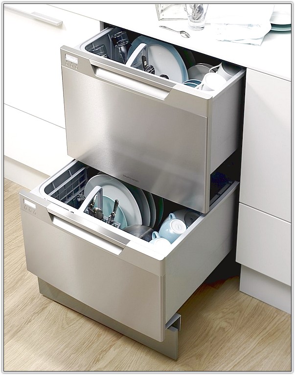 You can see the main advantage right? No bending down. I recently switched our dinner plates to a heavy 12" stoneware and, wow, it is an actual physical effort to pull out a fully loaded dishwasher tray. The counter height drawer is good design - especially for folks with limited mobility. The double drawer model retails for $1800 - $2200 CAD. Let's talk about the two-drawer set-up. Amazing, right? Great energy efficiency to run half a load or do a quick mid-party clean-up. Some models have adjustable racks to custom fit tall stem glassware and large plates. 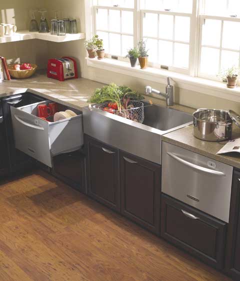 Image via: Domesti-Tech 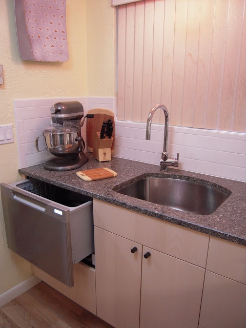 Image Via: Ikea Hackers Small kitchens and small households can take advantage of the single drawer unit and save cabinet space. This makes so much sense in a new-build condo where every square foot of reclaimed space is precious. Here, an Ikea cabinet was hacked to accommodate a dishwasher drawer with space leftover. This model retails for around $1100 CAD.
Fisher & Paykel is carried in Toronto at Tasco Appliance (who publish prices online) and Caplan's on Weston Road (who do not publish prices). The showroom in Mississauga shows the full range but is not open for retail sales and does not show MSRP.
0 Comments
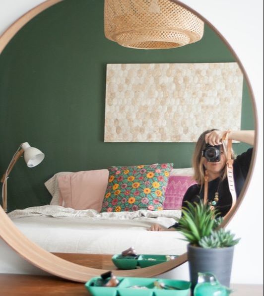 Hey there! The bedroom feature wall project started at 9:00 am with a trip to my local Benjamin Moore for a gallon of Natura in Peale Green. 20 minutes of prep (move the bed, dust the baseboards, tape the ceiling and side walls) and by 10:30 the first coat was on. The second coat was on after lunch and by 3:00 I was at Home Sense looking for accessories. It was that fast. 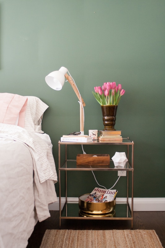 Real houses have cords, as I was recently reminded, so I fought the urge to zip tie it out of the way of the photo. Love the way the pink tulips look against the green, so I picked up some really pretty hemstitched pillow covers in a paler version. 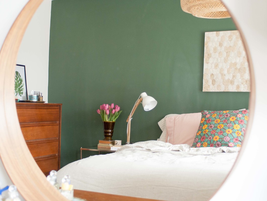 The patterned pillow cover was $4.95 at Ikea. It's part of a new boho/tribal collection, that was being unpacked and merchandised as I happened by Tuesday evening. Some really cute, colourful stuff like baskets, thick floor cushions and rattan furniture.
The tallboy dresser in this shot is one of my finest garage sale moments. I scored this piece, the matching long dresser and a nightstand for $35 at a yard sale 12 years ago. $35 for all of it! 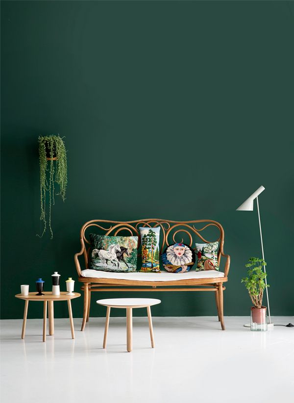 Photo via Domino Mag I'm in the unusual position of having completed a class assignment three days early, and my husband is out of town until Thursday, and the sun is shining. It's the perfect storm: I must paint something. A feature wall is the ideal one-day challenge. My entire house was painted the BM Cloud Cover last summer, a nice warm but not yellow-y white. I really like white walls. I intensely prefer white walls. But this gloomy stretch of weather has me hankering for some colour, or maybe it's just a craving for change. I'm a restless decorator. I've decided to paint the headboard wall in the bedroom green. We don't have a headboard, so all the more reason to add some umph to this particular wall. Here's what I'm thinking: 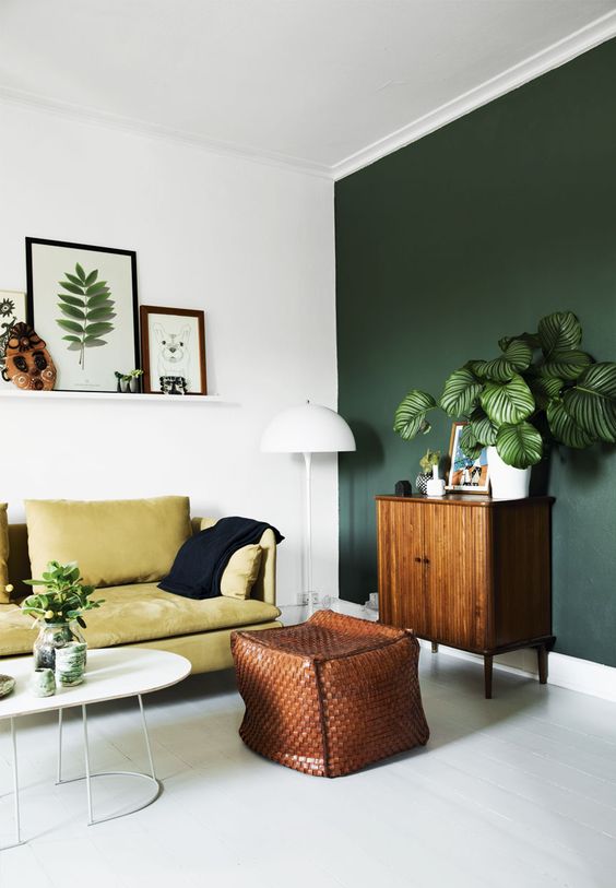 Image via Pinterest I really love this intense blue-green contrasting with the orange tones of the wood. Gorgeous. 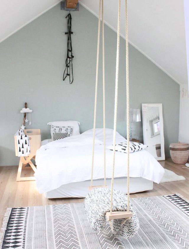 This silvery sage green feels so Scandi/90s with that blonde wood floor. I like, but it's paler than what I have in mind, and my floor is mid-toned oak so this might look flat. 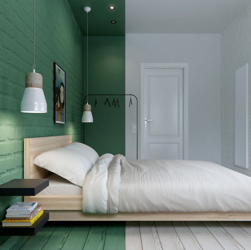 Image via Pinterest Not only is this a great colour, I've never seen paint continued on to the floor like this. Love! Image via Benjamin Moore These are the three large chips taped to the wall today. Guacamole, Terrapin Green and Avocado. One will be the winner tomorrow!
Sounds weird but, next to kitchens, entryways are my favourite area to design and style. It might be easy to overlook your entry but, as the most public space in your home, it deserves attention. Everyone sees your entry: family, friends, FedEx, the guy delivering pizza. It's not just a landing zone for shoes and coats, keys and backpacks, it is a literal entryway into the rest of your home. Make it good! The "no-entry entry" we see below is a common situation in Etobicoke bungalows. The front door opens right into the living room and there is no physical separation between public and private space. Short of construction there is no remedy, but the feeling of an entryway is created here a nicely scaled table, lamp and artwork in this room by SJ Interior Designs.  There is never just one way to decorate a room, so I thought it would be fun to change a few things - pretty though this entry is. Here is how I would add a bit more function and change it up: 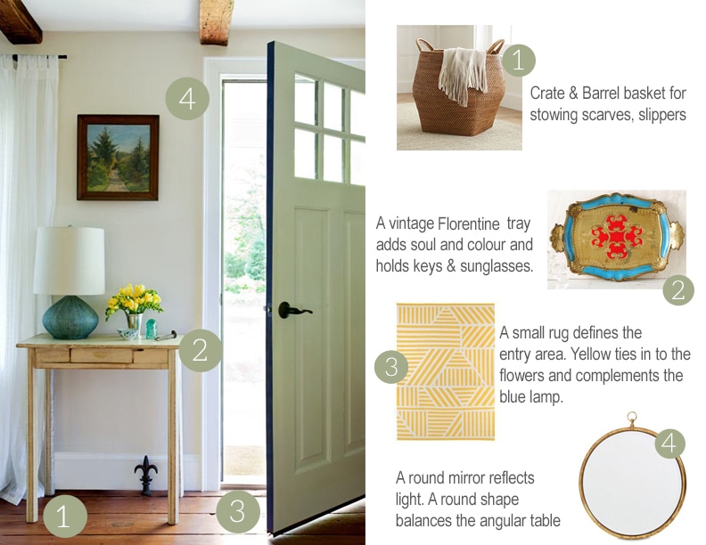 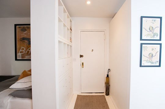 Looks like a Toronto condo, doesn't it? This strictly single file entryway makes the best of an awkward space with a wall of super-functional built-in cubbies and drawers. Here are three easy but dramatic style changes: 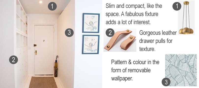 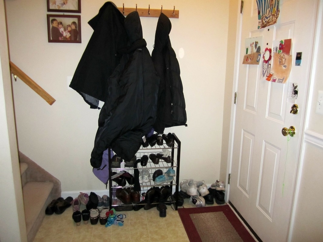 This is a fairly typical entry in a small semi-detached or townhouse in Toronto. It is obviously not an ideal layout, but let's work with what we have. Assuming we can't relocate the coat and shoe storage to the wall to the right of the front door, a longer Shaker-style peg rail with a good amount of space between the pegs will hold more and look less congested. Ikea makes a slim shoe cabinet that looks more furniture like and would fit in this tight spot. Next, I would swap out the beige floor tile for something more exciting and re-carpet the stairs in a neutral sisal. Paint the handrail glossy black and the front door a new colour. 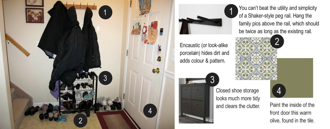 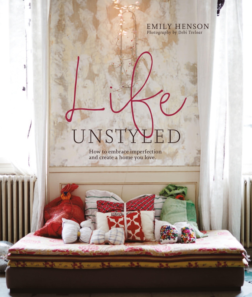 Just finished Emily Henson's new how-to book, Life Unstyled, which I consumed in great, greedy gulps. Oh, how I loved it. It's the decorating equivalent of a naked face selfie. Sort of. These are still incredibly beautiful homes with great architecture and European style, but to read a line like " just say no to colour-coordinated book stacks" was like therapy after falling down the rabbit hole of Instagram and those perfectly groomed rooms. It's good to remember that houses are lived in. And most people are messy, dammit. A casually placed chunky knit blanket does not make a room lived in. 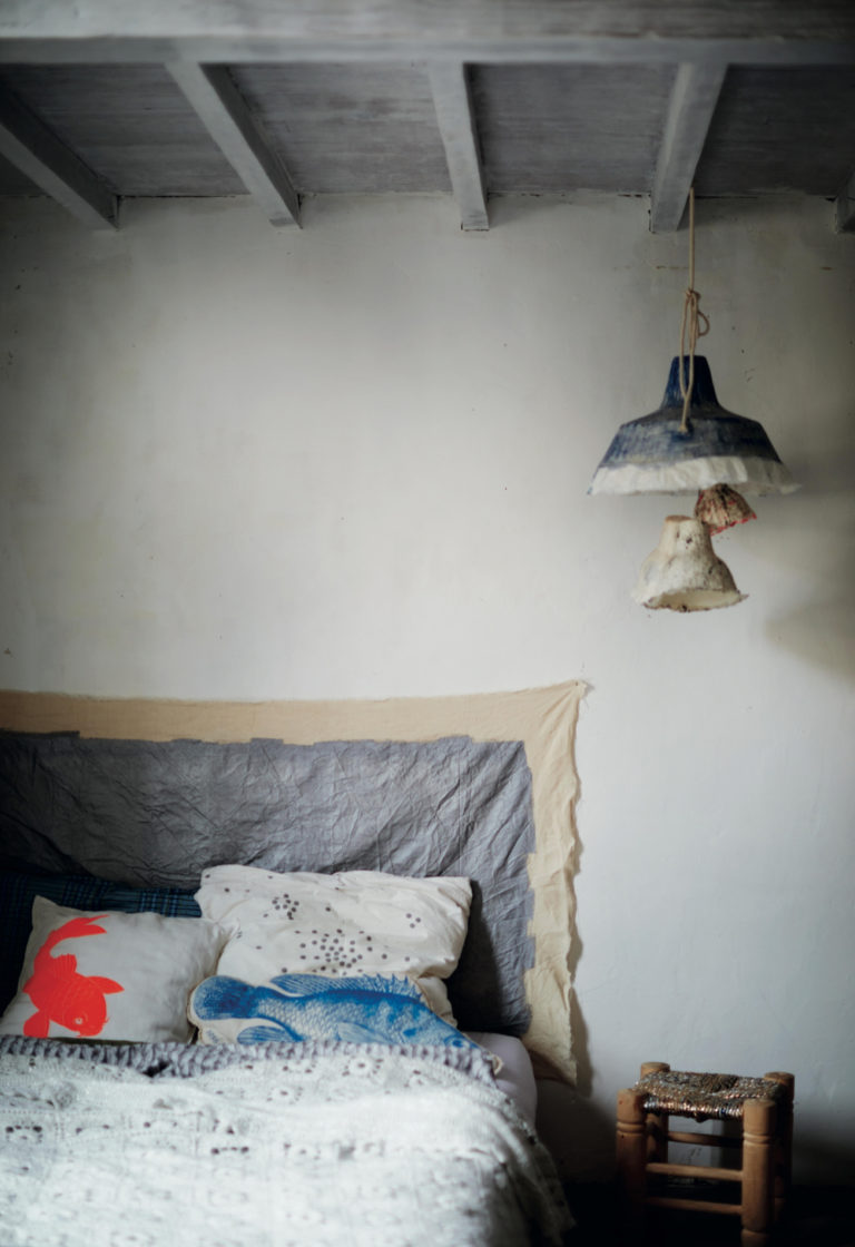 Image: Debi Treloar for Life Unstyled This scrap of silk, nailed to the wall (nailed for goodness sake!) is kind of louche and aimless in the best way possible. Don't apologize for your headboard-less bed. I don't have a one (and probably never will) because my bedroom is too small and I will never not have a king size bed. It is still a minor point of disagreement between my husband and me - he being of the matching headboard and nightstands persuasion - years after I hung a biggish piece of art over the bed. The book contains an affirming message for collectors: it is A-OK to keep those mason jars of beach stones or wine corks or whatever because if they make you happy you ought to put them on display. I say yes, if you can make it look like this: 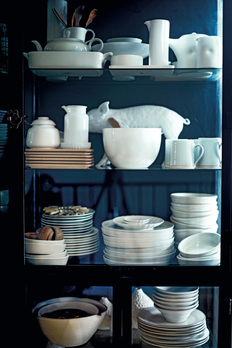 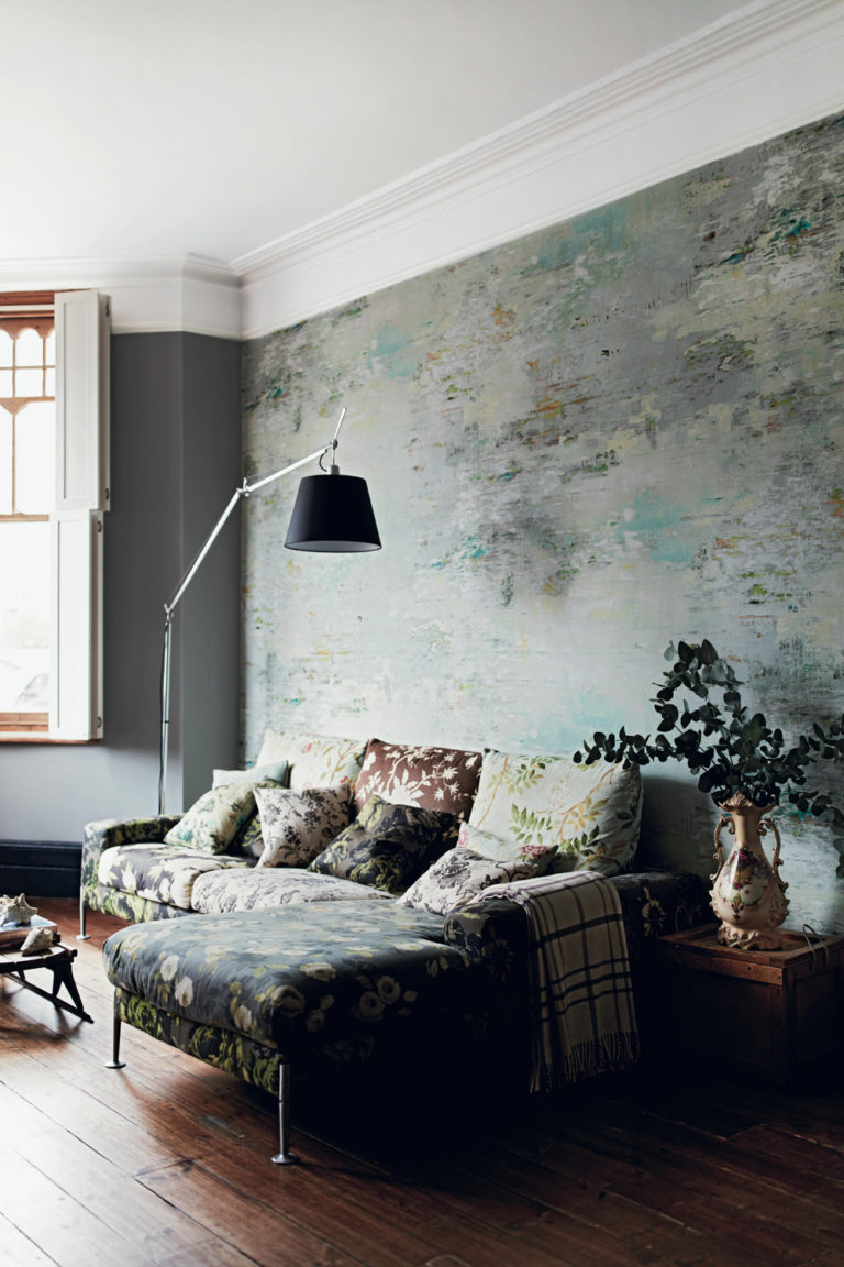 Slow decorating, repurposing rather than rebuying, putting creativity before perfection. This books nails it and makes me think, yes, I can (and should!) live peacefully if not perfectly. My favourite interiors book of winter.
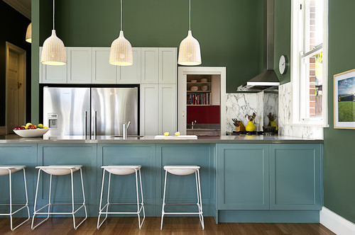
It's been two weeks without blue sky in Toronto. Believe me: I'm keeping track like it's a personal vendetta between me and mother nature. I need some colour. Without further ado, let's take a look at some kitchens that are decidedly not white.
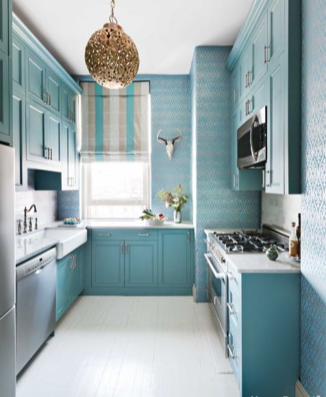
This gorgeous galley kitchen belongs to NYC designer Sheila Bridges, and it's a great example of how a small space can be well-appointed, functional and stylish. Metallic wallpaper, a large farmhouse sink, a Moroccan-feeling lantern, that blue...all unexpectedly glamorous choices that work together beautifully without sacrificing utility.
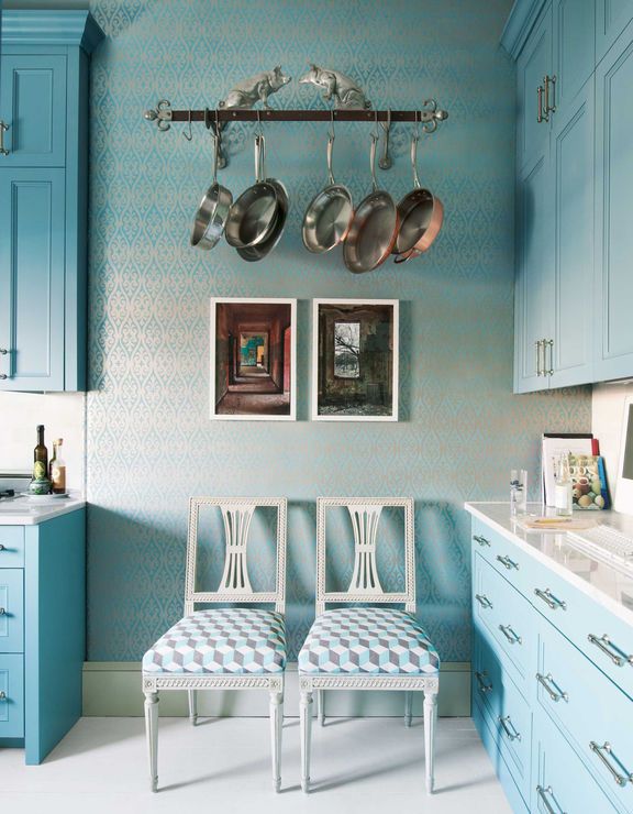
We don't see enough pot racks. I appreciate a kitchen that looks like people actually cook in it! Guests can take a seat on the antique Swedish side chairs while dinner is prepared.
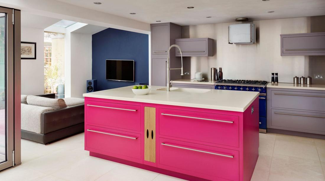
I don't think I've ever seen a hot pink kitchen island before. When I think about colourful kitchens, I immediately think cottage style. Weathered finishes. Vintage cookware. Painted furniture. Cute, charming, but not modern. This kitchen shows how to do colour in a clean, contemporary way.
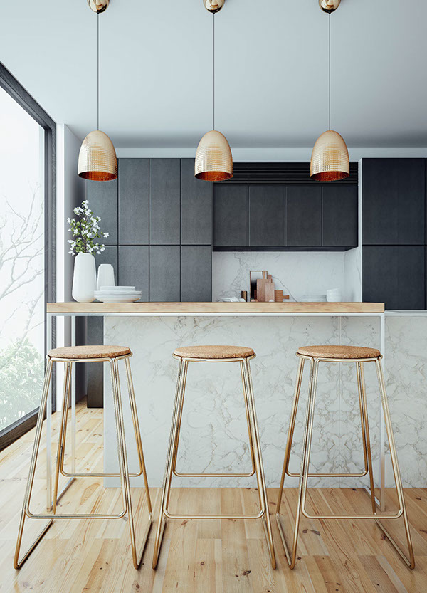
OK, so not colourful but not exactly white either. Warm, light wood with matte charcoal and copper is a heavenly combination. The stools tie in the pendant lights. The floors and raised counter coordinate. The grey veining of the marble plays off the dark cabinets. Skillful design right here.
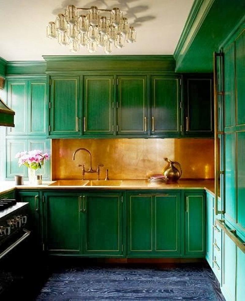
Pantone named Greenery (5-0353) the colour of 2017, to everyone's surprise. It's a bright, citrusy green, not like the deep emerald pictured above, but I think we can expect to see a lot more green - in every hue - in kitchens and textiles in the year to come. This rather amazing space (that copper backsplash!) belongs to Cameron Diaz.
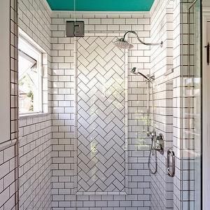
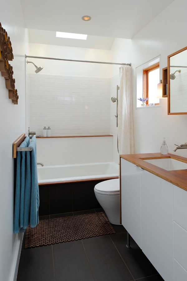
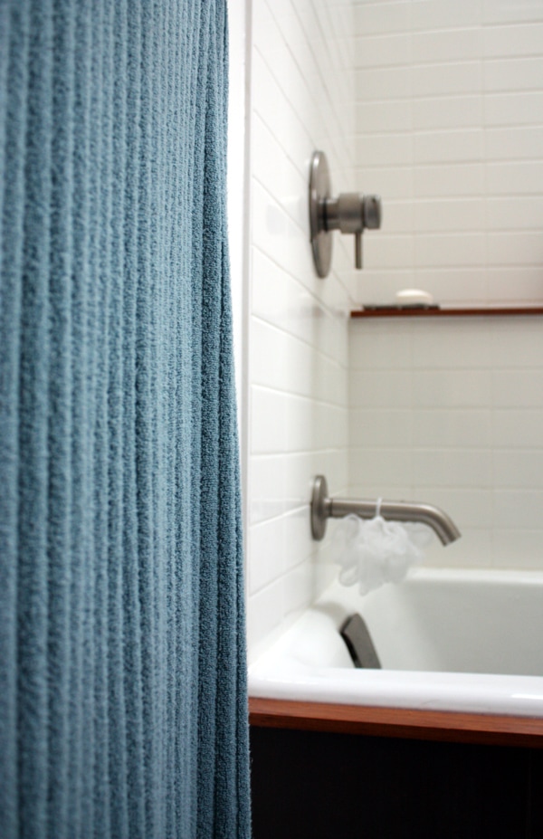
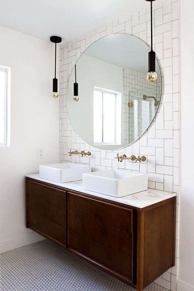
It's ubiquitous for a reason: subway tile is low-budget, easy to install, durable, and no maintenance. The only trouble is that it's everywhere. And that gets boring. My family bathroom - which sees hard use - was subway tiled eight years ago and looks brand new (thanks to diligent squeegy-ing and obsessive grout cleaning). I'm actually kind of hoping for a crack or something to happen so I'll have an excuse to redo it. For value and timelessness it's hard to beat, but let's shake things up a bit, shall we? 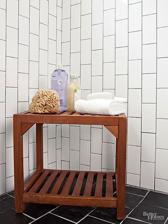 I kind of love this. The vertical running bond pattern looks totally modern, kind of masculine, and altogether different from the usual horizontal offset installation. This will make ceilings soar - so great for small spaces and basements. Dark grout plays up the pattern and ties in the dark floor. 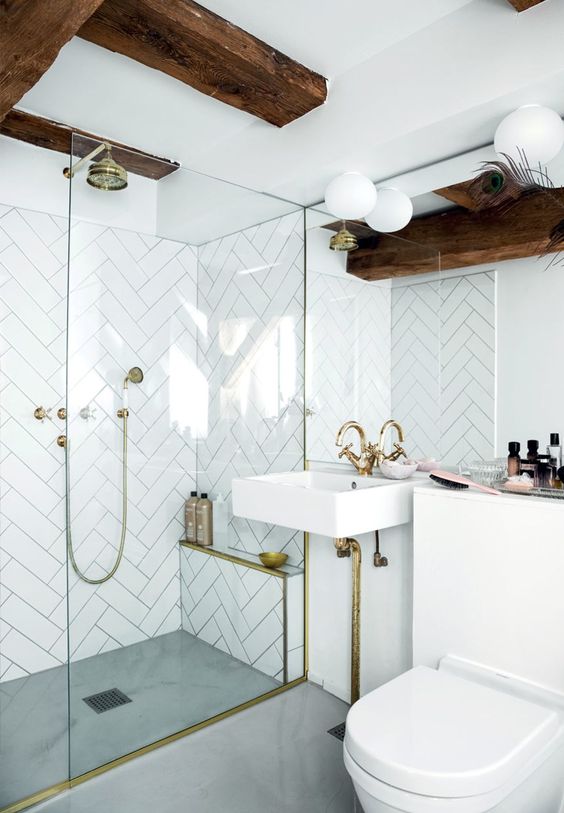 Subway tile comes in all kinds of sizes and shapes, but the one we usually think of is the 3" by 6" brick. This awesome herringbone pattern uses a longer, elegant 3" by 12" rectangle. Once again, dark grout really accentuates the pattern. Here you can really see the difference grout can make to a project. High contrast Vs no contrast. The stacked bond pattern looks simple and modern. You could also run this pattern vertically. 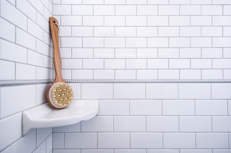 Mixing large and small tiles looks amazing. The beaded pencil tile makes the transition beautiful.  Here we have the regular offset installation looking super interesting because it used square subway tiles. 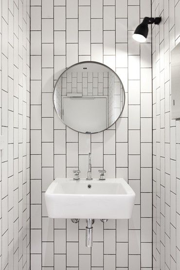 Floor to ceiling 3" by 6" tile in a vertical offset pattern in this tiny powder room really draws the eye up and up and up. Image: Remodelisremodelista.comta A sort-of herringbone pattern turned sideways looks fantastically interesting in this gorgeous bathroom.
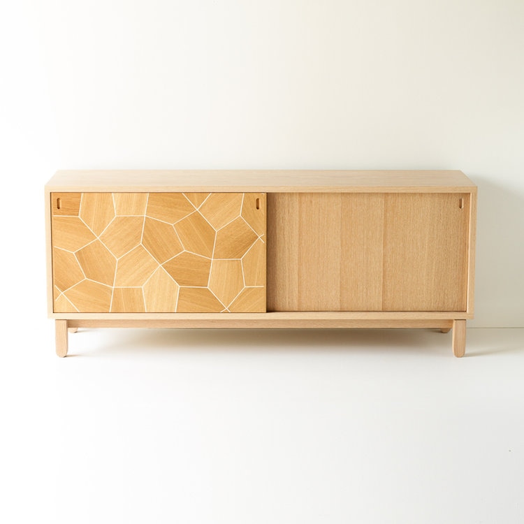 So many covetable things at this year's design show. We started at nine am and by noon I was at risk of Stendhal syndrome and sought relief outside beneath a grey Toronto sky. I'm still processing. And unpacking two totes full of samples, cards, and brochures. It was good. I will bring smelling salts to revive myself next year. Some of my favourite things? This beauty is near the top of the list. White oak, made in Ottawa by Christopher Solar, the Pentagon Credenza retails for $2,985. It's the right height for a TV or turntable and skinny enough to work in a condo. The booth at Surfaces & Co. was literally elbow to elbow with designers snapping pics of these extraordinary custom tiles that mix brushed gold metal with marble and glass. As you might guess, the price is not for the faint of heart. But a little goes a long way, so with a bit of clever planning it's possible to pair a $$$$ tile with a $$ tile. I'll post some ideas on that subject later. Sculptural, beautiful and made in Toronto's Distillery District, I fell hard for The Betty ceiling fixture on the left. She retails for around $2,500 with an eight-week lead time. I think sconces are an underused light source, don't you? They do require electrical planning, so it's best if there's a reno going on and the walls are open. Outside of framing a bathroom mirror, I don't think we use them enough. Another future blog post! 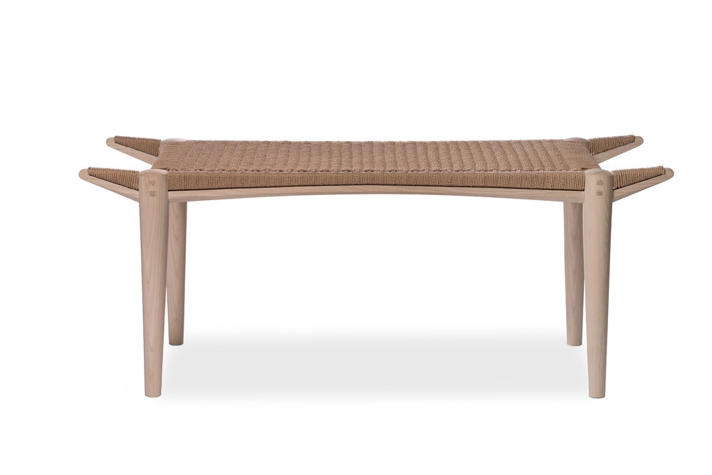 Made in Hamilton from Canadian Black Walnut with a woven seat, this bench is part sculpture, part heirloom and part utility. I love the perfect mortise and tenon joinery, barely - but importantly - visible. It says "Hey man, I did not come from West Elm."
 image: Nicole Morell Interiors Most decorating projects don't start with an empty room. A more likely scenario is a room with a few nice pieces that feels unfinished despite a dozen trips to Home Sense in search of the right throw pillows. When decorating inertia sets in it's time to call in the pros. Having a decorator evaluate your layout and existing furnishings and recommend changes is like hiring a personal trainer for your living room. Digital or E-Design is an amazing solution if you're working with a smaller budget, live out of town or if you're just not interested in having a decorator come to your house. Working together by email, I ask lots of questions to understand your style, budget and the pieces you're working with. You send me photos and measurements of your space and I come up with a design concept. We review my ideas, make any changes you'd like to see (maybe a different lamp or rug) and I finalize your plan with detailed implementation notes and a shopping list with sources. Click for E-Design pricing and more details.   image: Chasing Paper (link in image) I've used wallpaper in every home I've ever lived in. There was the teal floral print in my teenage bedroom, a mid-century geometric in the kitchen of my first crappy basement apartment, black and white toile in the bathroom of the mid-town attic loft, a fairy print in the closet of my daughter's nursery, and a metallic damask feature wall in the master bedroom of my current home. While I don't, generally, like a lot of colour on the walls, pattern is a different story.  image: Anthropologie (link in image) Wallpaper used to be a commitment though. Even the pre-pasted vinyl stuff wasn't the easiest for a rookie to hang. Forget about ever getting it truly straight and bubble-free. And removal? Well, that was best left to the next occupants to steam and scrape off. 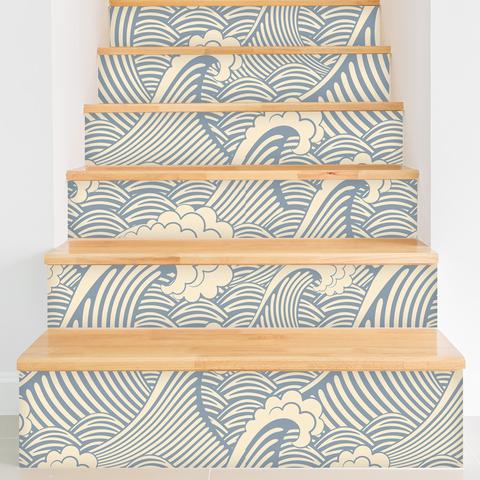 image: Walls Need Love (link in image) Ah, progress! Wallpaper 2.0 is peel and stick. It asks nothing of you other than to love it. There is no long-term commitment, no professional installation needed and no hassle removal when it's time for a change. It's a low-tack decal that allows you to apply, reposition if you make a mistake, and take 'er down when you're bored. Oh, and it's totally affordable: under $200 for a 10' feature wall. 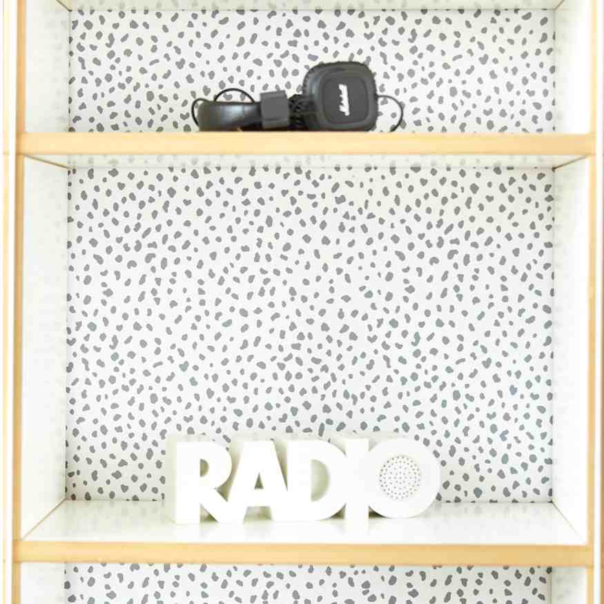 image: Chasing Paper (link in image) It's not just for walls, either. You could paper the back of a basic bookcase, or the inside of a closet for a little peek-a-boo action. Dorm walls, real estate staging, rental condos that won't let you paint, kitchen cupboards that need a quick facelift: yep, yep and yep. 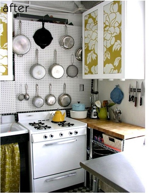 image: Centsational Girl (link in image) No-budget kitchen facelift. Great look in a cottage. 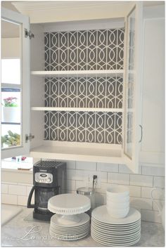 Cabinet surprise. Introduce some colour and pattern in an all-white kitchen. 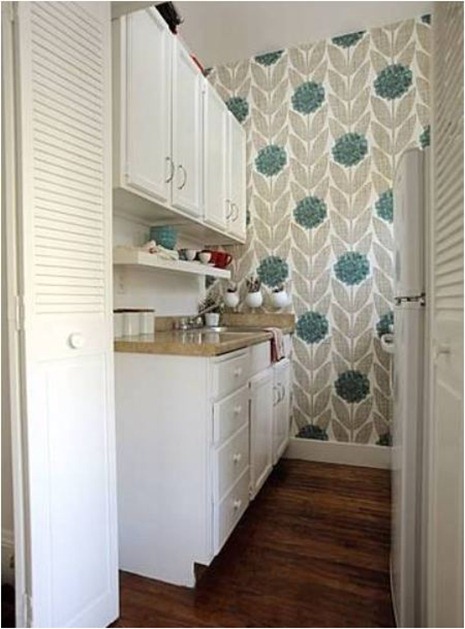 Feature wall in a rental. So nice the owners will ask you to leave it.
|


 RSS Feed