|
Once the exclusive hallmark of a high-end modern new build, horizontal fences are popping up everywhere. I love how they can add a contemporary shine to an older home. With more builders experienced in horizontal fence construction, it's no longer considered an unusual request, and prices have come down. As always, it helps to know what you want and to be informed before you contact a builder for a quote. Take a walk with me around my Etobicoke neighbourhood and check out some horizontal fences. 1. Basket Weave 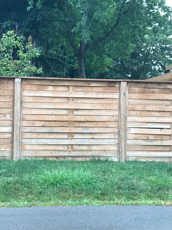 This basket weave-style fence is being allowed to naturally weather to a greyish hue. See the photo below for a basket weave that has been stained. One other design difference between the two is the use of a flat 2" x 4" to finish the fence sections to an equal height, whereas the lower photo has the fence posts left taller and then capped. It's a personal preference. I would, however, always recommend 6" posts, which you see in the photo above. We are getting some crazy wind storms in the GTA and stronger posts are a good idea. One potential issue with the basket weave is the gaps that occur if a board is warped. Have a look at the right side, a third of the way up and you'll see what I mean. I'm curious if that one board could be replaced with a straighter plank to eliminate that gap. When I walked by this yard I could see right inside, so if privacy is a consideration you should opt for a different fence style. 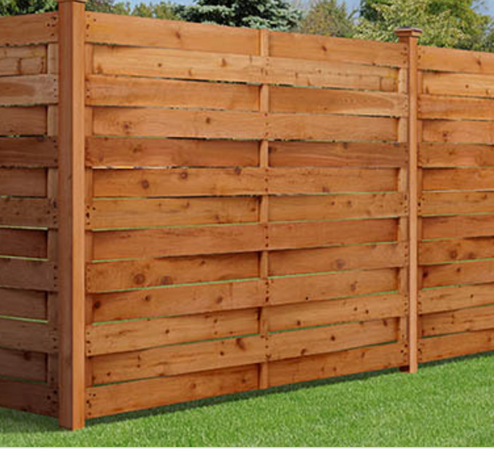 2. Board on Board Board on board is less expensive to construct because you're only finishing one side of the fence. However, all lumber shrinks as it dries and those spaces between the boards can and will become more pronounced over time, reducing your privacy. If you opt for this style, have the boards placed right against each other during construction so you will end up with the smallest possible gap a few months later. As you can see here, horizontal fences tend to accentuate any flaws in lumber. You want to have good communication and clear instructions with your fence builder about your expectations. Do an informal inspection every section and work out any problems before the job is completed. This style is not finished the same on both sides; there is a "good side" and a "bad side". This is the "bad" side, because it is less finished with the vertical 2" x 2" support piece in the middle. 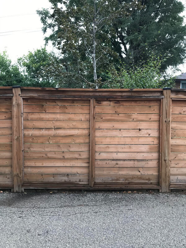 3. Board on Board - non pressure treated 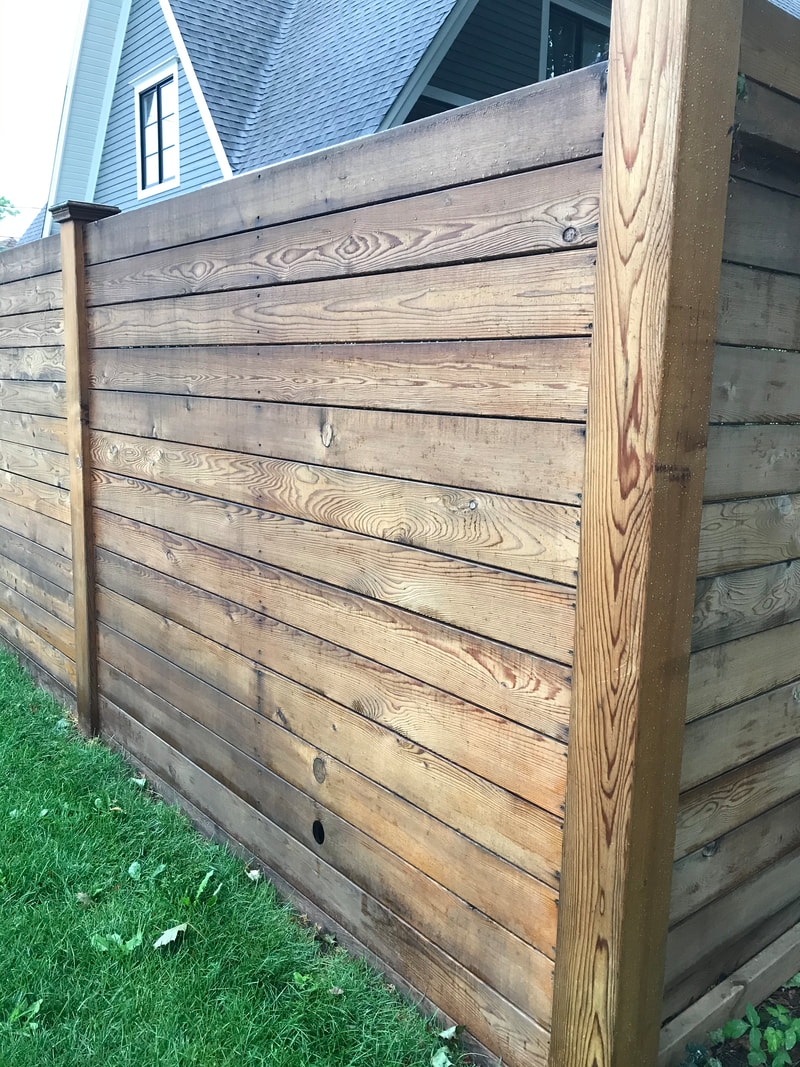 The fence at one of my favourite homes in the neighbourhood (a David Smalls design) is also board on board, but not pressure treated. I'm assuming cedar, since that is the next most common fence lumber but perhaps it's something else. The takeaway here is nice, even spacing with good straight boards and a natural stain to finish. Lovely. Side note: I believe that drilled hole at the bottom is for drainage, which is a crucial conversation to have with your landscaper and fence builder if your yard has a lot of hardscaping. Without positive drainage you'll have a pond and a skating rink for some of the year. 4. Horizontal good neighbour 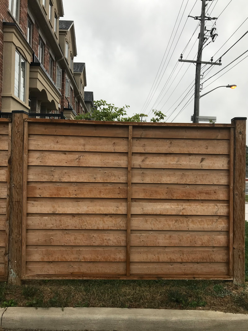 For the ultimate in privacy, you can't beat the "good neighbour" style, so-called because it looks identical from both sides. It is the most expensive to construct because of increased lumber and labour. It is also more forgiving of less-than-perfect boards. But your fence builder does need a carpenter's eye to space things correctly.
One downside to this style is a distinct lack of airflow. It will contribute to a warmer micro climate in your yard, which may or may not be an issue depending on your orientation and shade coverage.
1 Comment
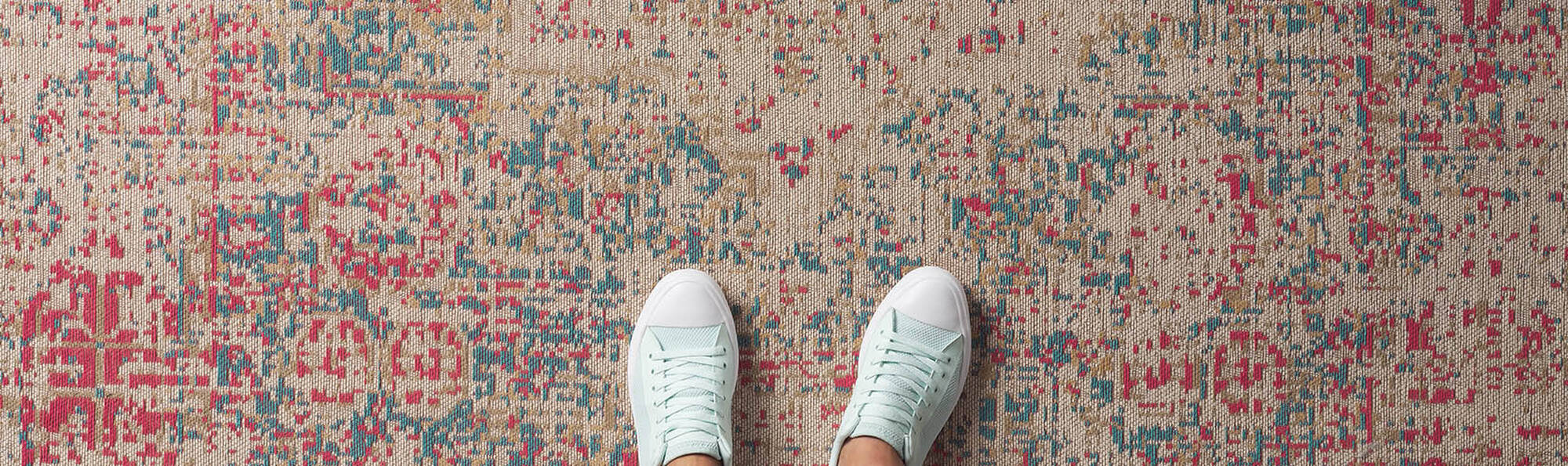 Image: Urban Barn It's true that most people have rugs that are too small. My guess is that 5' x 7' rugs are readily available and more affordable than 8' x 10', so they're easier to bring home and try out. Most bedrooms and living rooms need an 8' x 10' or 9' x 12' which aren't easy to sling home, but the result is so worth it. Everyone loves guidelines, so here are my go-to rules for getting the right size rug: 1. Measure your sofa and add 16" You want to have at least 8" of rug visible on each side the sofa. If you have a side table, add that to the measurement so the table is sitting entirely on the rug. 2. The rug should sit at least halfway under the sofa I'm not a fan of just the front legs perched on the edge of the rug. It should go to the mid-point of the sofa's seat depth. 3. In an open concept room all the furniture sits on the rug If your sofa is against a wall point #2 is a good guide, but in an open plan room where no furniture is against the walls, you want to define the seating area by having all the furniture on the rug. 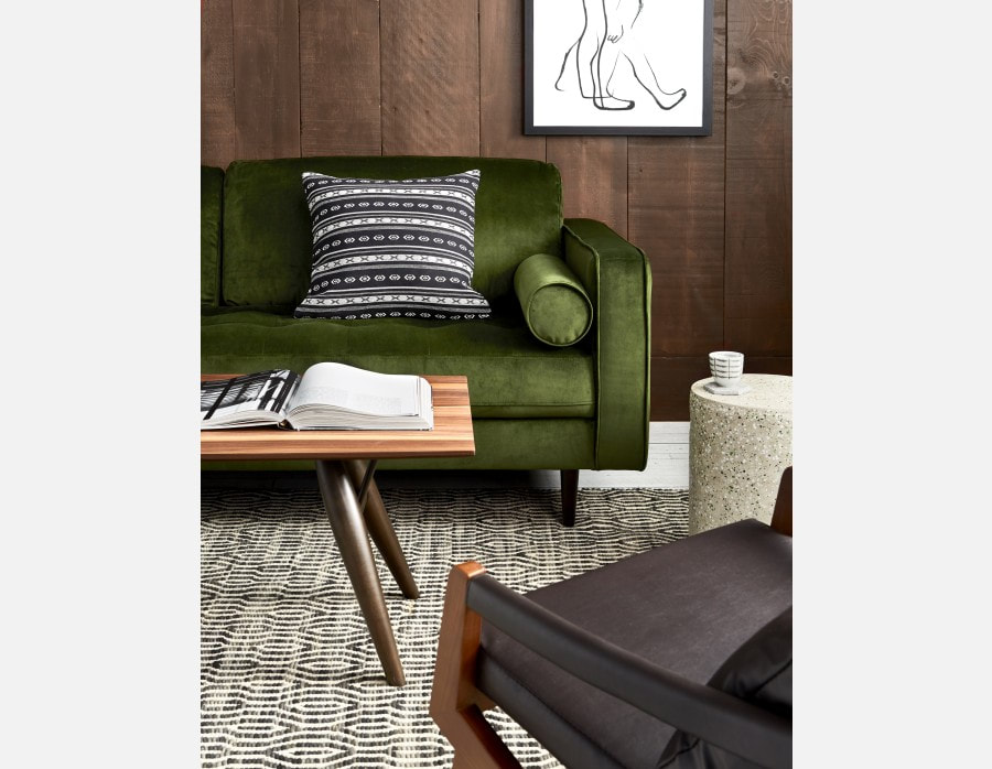 Image: Structube Illustrating guideline #1, it's important to measure at least 6" on each side of the sofa. You need more if you have a side table. The entire table should fit on the rug or be entirely off the rug. 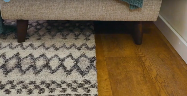 #2 . When your sofa is against a wall the rug should be about halfway back.  #3 in action. A rug large enough to accommodate all the furniture looks right in an open plan room. Breaking the rules...or solving problems I've fallen for a vintage rug once or twice, and they tend to be odd sizes or smaller sizes . But when you like something you find a way to make it work. If you're stuck with a too-small or non-traditional sized antique rug - and you love it - there are options. If you don't love it, don't invest any more of your time, money or emotional capital into keeping it. Don't succumb to the sunk cost fallacy. Find a good place to donate it and get yourself the rug of your dreams. 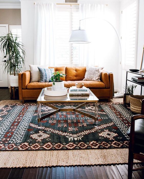 Solution #1 Layer Layering a too-small rug that you love with a right-sized rug is a great solution I've found they shift around a bit, especially with kids in the house, so lay an anti-slip mat or use carpet tape if that won't damage either rug. 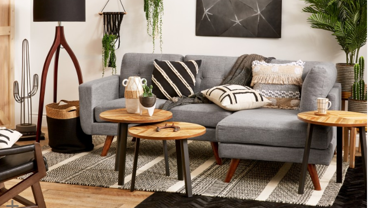 Solution #2 Mix two small rugs I love how interesting and unexpected this looks. It's a great move if you have two 5' x 7' rugs.  Solution #3 repurpose This will only work with lighter weight rugs like kilims and flat weaves. Chairs, benches, ottomans and poofs can be readily upholstered using an old beloved rug. If you can't bear to have it cut up, consider a smaller rug as a wall hanging. They can be used in place of a headboard in a casual, boho-style bedroom. 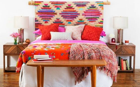 Solution #4 Relocate it
If you love the rug find a new room for it. - but make sure it's the right size for the job! I accompanied some friend-clients recently on informal shopping trips to help them decorate their homes for the holidays and to find the ultimate throw pillow combination. In both cases, their homes are "done" and lovely and what they wanted from me was to go shopping with them not for them, as I normally would. Usually I work for clients who have either no time or interest in shopping (often both) and who are grateful to have someone edit and then present options to them. These clients had the time and interest to shop but felt overwhelmed or uninspired and wanted a stylist's eye to help them pull their rooms together. We hit up Home Sense, of course, because that's every budget decorator's first stop, and I introduced them to a couple of my favourite trade showrooms for those special things you won't find in chain stores. We shopped, we had a bite to eat and we went back to their homes to put everything together. If this sounds like something you need or want, please get in touch! I'm happy to help. These one day makeovers are incredibly satisfying and cost-effective! -Nicole 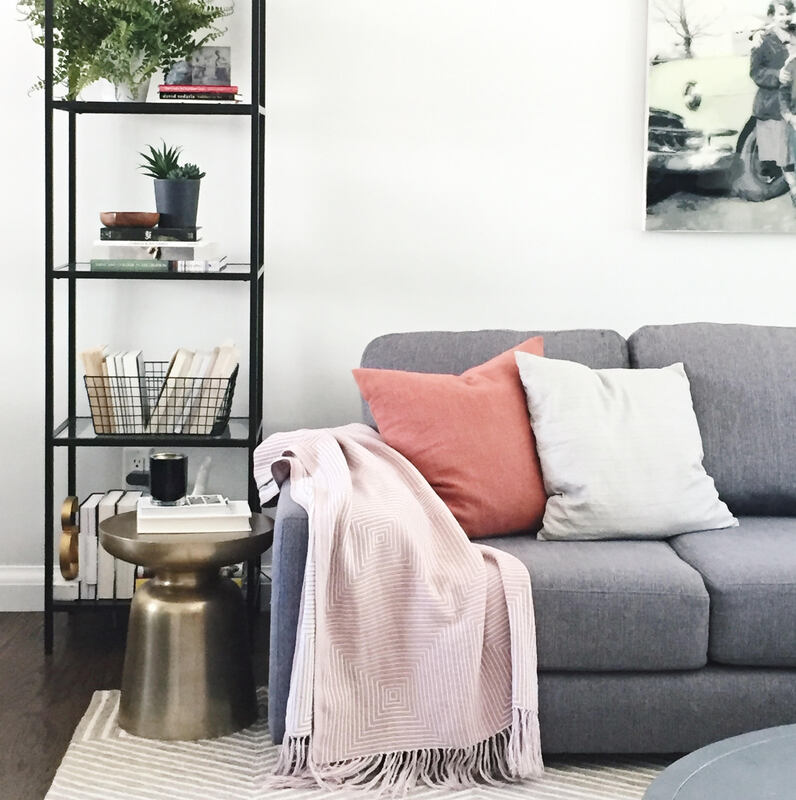 While I don't string lights or climb on rooftops (but I will find someone who does!) I can turn your porch or entryway into a welcoming, postcard-pretty space for the holidays. It often doesn't take much - some outdoor pillows, a festive weather-proof blanket, lanterns (always!) and fresh (always!) greens - to add cheer to your outdoor space. Call or drop me a line and let's spruce up your entryway for the holidays. 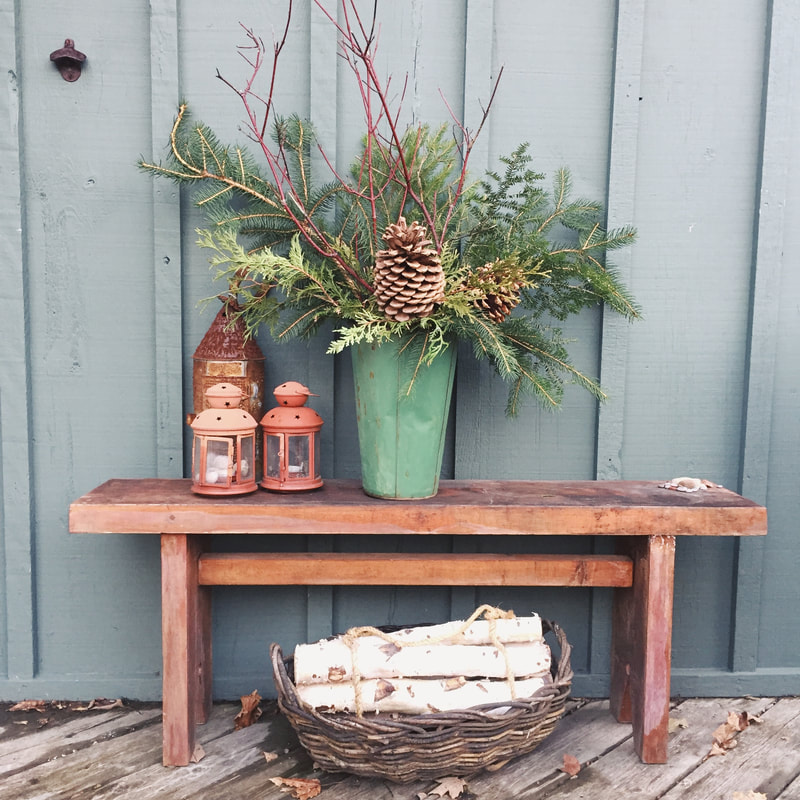 I'm anti-organizing because in my experience it meant buying a lot (A LOT) of expensive boxes and bins to warehouse stuff I didn't know what to do with. The habit of decluttering, of just getting rid of stuff full-stop, is so satisfying to me. I haven't gone full Kondo. There is still room for improvement, which is what lead me to click on this Apartment Therapy article: 54 Things Absolutely Nobody Should Be Storing, Anywhere.
Prepare to feel awkward! Totally guilty of #2, 19, 27, 53... Our decision to buy this unfashionable house in an unfashionable neighbourhood was, for a long time, kind of like dating a guy who you weren't really attracted to but who ticked other, more important boxes. And then you made him have plastic surgery. Here's what I mean: 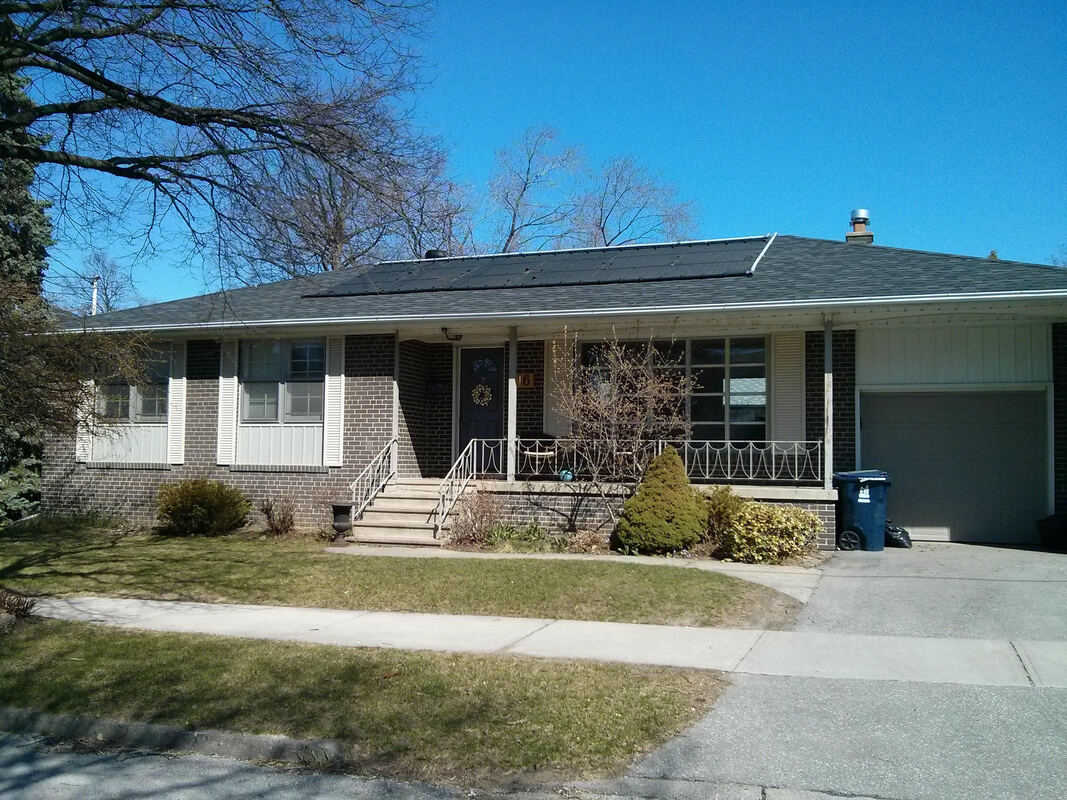 Nothing looked good. The too small, too high windows, the ornate wrought iron railing, the white eavestroughs and landscaping that had seen better days. I even thought the brick colour was weird. But the neighbours were delightful, the schools great and we could walk to parks and the library and pokey Cloverdale mall where time stood still but had a coffee shop and a bookstore. We were happy but a tad defensive about our choice. Or at least I was. I've always put my insecurities right out there. But look! Here's our fella now! He's the same but BETTER. So much better. 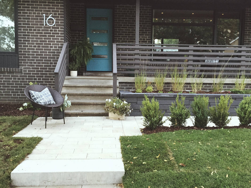 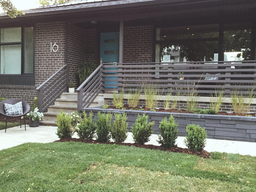 I can't emphasize how much I hated that curving walkway from the driveway. Ugh, that curve. That flagstone, all lumpy and cracked. Worst of all was not having a connection to the house from the sidewalk. Do you know how many trick-or-treaters just walked on by because they didn't want to go up the drive and across?
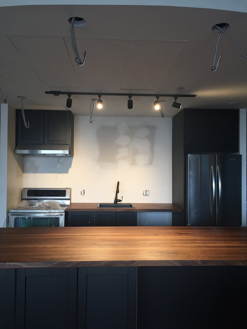
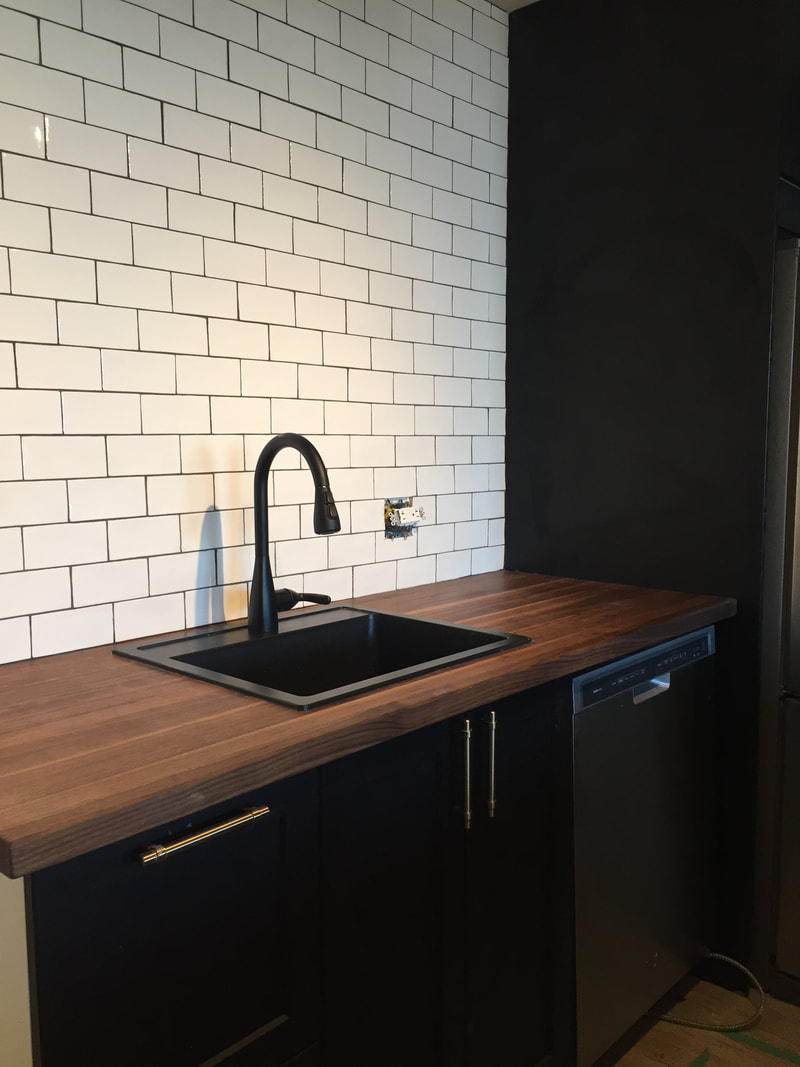
But now there is a proper connection between sidewalk and house. A right angled 4' wide walkway that is level and properly sloped for drainage. It's the best. Those boxwoods? They keep my kids from cutting across the grass and wearing it out. Everyone goes up the path now! Raising the planting bed was a chance to add architectural interest and contrast with '60s-inspired pavers in soft black. The planter is just the right height for sitting and has become a gathering place in the evening. It's wonderful. I'm not a gardener so I chose low maintenance, hardy grasses and a few forgiving perennials. I'm excited to watch it fill in. So happy with our house now. I've even come around the brick colour. Ta da... Same floor, same appliances, same island footprint and same ceiling height but what an improvement! Doesn't it seem much taller now that the upper cabinets are gone? Much more bright, open, inviting and, most important, functional. If you're assuming that storage was sacrificed, you'd be mistaken: there is a huge net gain in functional, usable storage. Here's why: 1. The floating shelves are 5' long and hold all the client's glass and tableware. 2. The fridge-depth cabinet adds twice the storage of the old, shallow cabinet, and it is easily accessed now, whereas before a big stretch or a step ladder was needed. Cutting boards and infrequently used appliances have a home now. 3. Swapping out the huge sink for a smaller one made room for an additional base cabinet. 4. We installed a pull-out garbage and recycling system beneath the sink and made sure the plumbing lines were as tight to the cabinet as possible to make the use of every inch. 5. The 10-foot island has 48" of cupboard space on the sitting side. Not only does this make the island seem less monolithic, it adds a ton of useful storage for wine glasses and bottles in one side and paperwork and miscellany on the other. 6. The working side of the island is loaded with drawers - no cupboards. Everything is visible and readily accessible. We meticulously planned what would go in each drawer so nothing was left without a home. 7. We designed an open shelf to hold the microwave at counter height in the island so we could do away with that dated and bulky over-the-range microwave unit. 8. A glossy backsplash reflects light. We tiled the side wall by the stove for easier cleaning and improved fire safety. 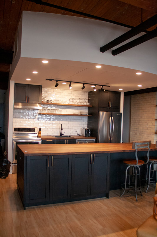 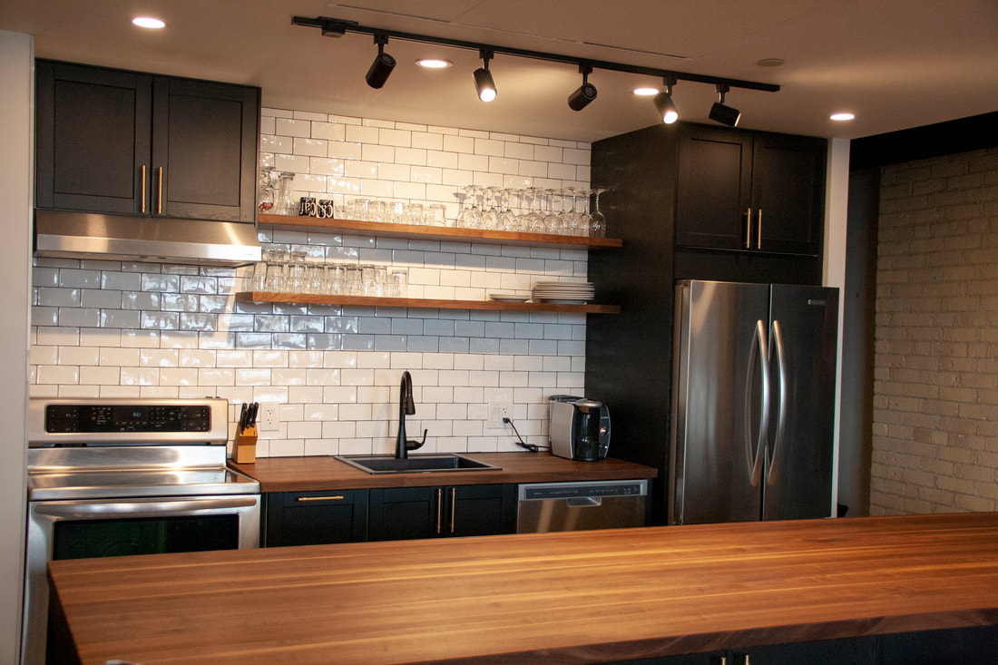 And let's talk about these walnut countertops for a moment, shall we? Remember that old curving granite top? It was cold to the touch and made a clattering echo-y noise when you placed a glass or plate on it. Oh, and it had a big seam running down the middle because no one can get a 10' slab in a 7' elevator so it had to be installed in two pieces and joined on site. Yuck. Wood is warm and soft, both visually and to the touch. It has great acoustic absorption so it's much quieter. And it was delivered in one great slab so no seams or joins to deal with. Price wise it was on par with quartz, so definitely not a budget option but I think it was a worthy place to splurge. Not replacing the major appliances gave some savings, so let's think of it that way :)
Just about wrapped up over at the loft kitchen project. It's been a fun four months with a client who knows what he does and doesn't like but is open to suggestions - collaboration heaven! When we met back in November it was pretty obvious that this space could be dramatically improved even if we couldn't redesign the kitchen footprint due to condo and budget constraints. When I look at the "before" photos, this is what I see: * Cramped, crowded and low-ceilinged * Zero counter space on the back wall * An over-sized sink that is too large for a small kitchen with one cook * A stove jammed up against a drywalled wall * A fridge that looks disproportionately large * Upper cabinets that are too tall to be functional * Inadequate lighting * A bulky microwave/exhaust fan combo that appears to be crouching over the stove * A massive island with a dated crescent shaped granite countertop * Bland and unexciting finishes - not worthy of this gorgeous loft! 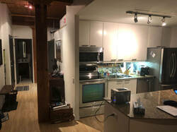 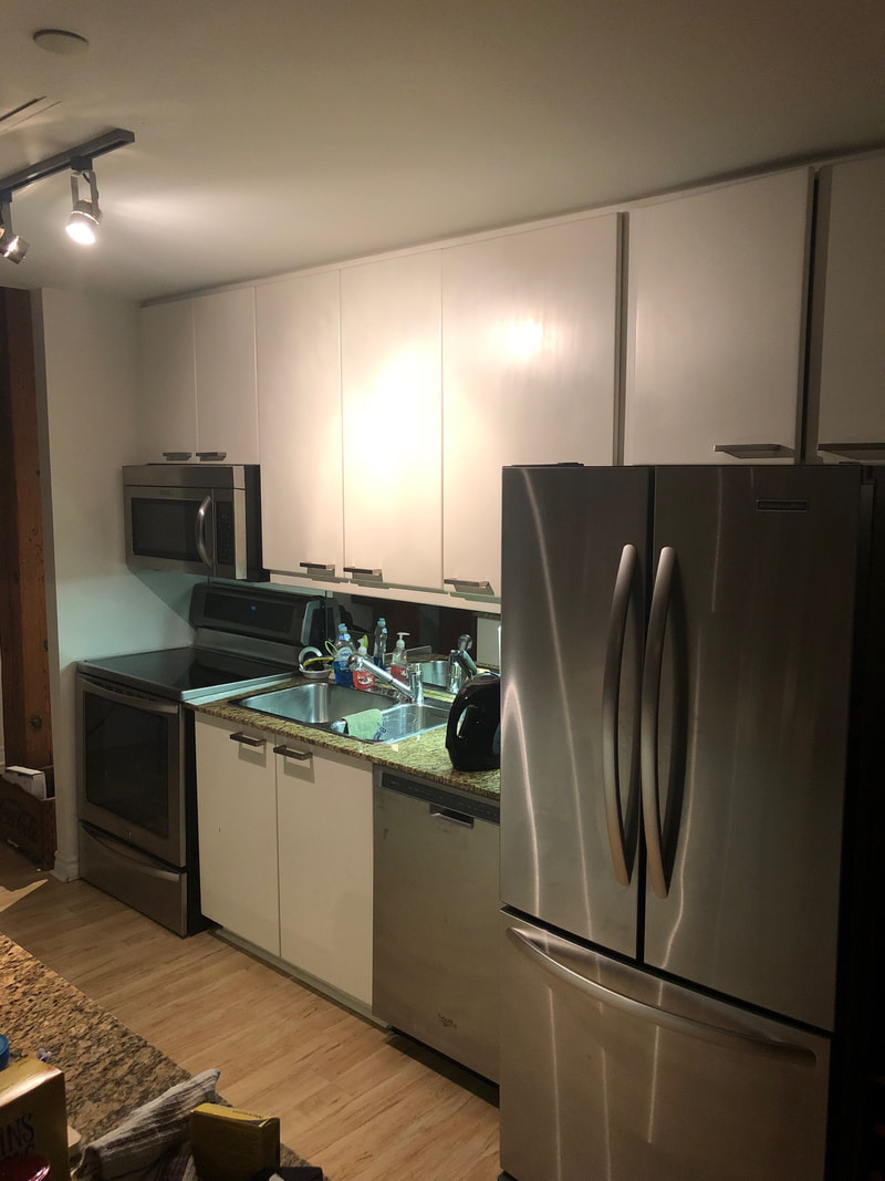 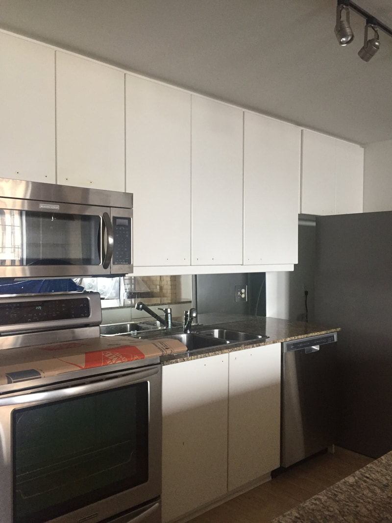 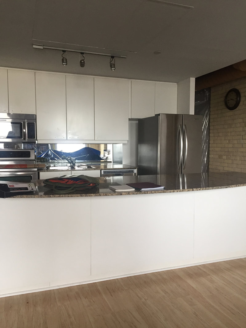 From here we created a wish list: * More open and bright overall * More functional space with useful, purposeful storage * Stylish with a vintage loft feeling And we discussed the constraints that ultimately determined what was feasible: * floors are not changing so the island has to keep its original footprint * appliances are new and will not be replaced at this point (except the microwave) * plumbing lines can't be moved * 7' ceiling due to HVAC bulkhead won't allow pendant lights over island * limited ability to change electrical due condo regulations and expense * building elevator cannot accommodate a 10-foot stone countertop in one piece, so quartz, marble etc., are not options unless we have a seam (which we do not want) * client is not moving out during the renovation so the project must be done with in-stock items to minimize downtime * budget - this is not the client's forever home and the condo may be put on the market This was the layout that eventually ticked all the boxes: 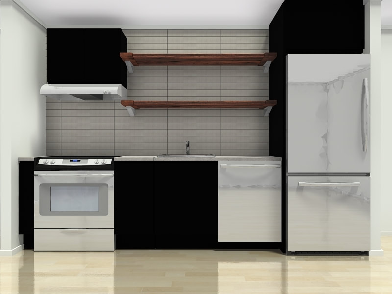 I wanted to move the cooking function into the island with a wall oven/cooktop combination to free up some counter space on the back wall, but we couldn't make it work without scaling up the budget for new floors, thousands in electrical and new appliances. It was one of those tough decisions, but I knew the kitchen would be much better either way, so we agreed to keep the existing stove in its current spot and focus on other, more attainable improvements. Removing those upper cabinets in favour of open shelving completely changed the look of the kitchen. It went from dark and low to airy and open with a glossy tile backsplash. Adding a gable beside the fridge and a fridge-depth upper cabinet puts the refrigerator into better proportion. Swapping the 36" double sink for a 24" model means more counterspace and gave us room for an extra base cabinet beside the sink - perfect for cutlery and cooking utensils that were previously stored in the island. 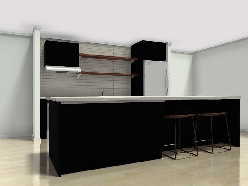 The island, as I mentioned, is ten-feet long! It's huge but had zero function. Because the laminate floor did not run below the island, we had to keep the existing footprint. But we made it so much more functional by adding back-to-back shelves on the living room side. This gives and extra 60" of cabinet space - and who doesn't need more storage? Shrinking the seating area down makes it feel more cozy and less monolithic than it did before. 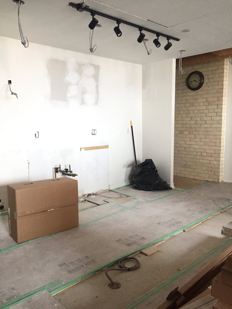 If there is any question about the impact tile can have, consider these two pre-and-post-backsplash images: The final touches are happening this week - please come back for a look at the full reveal!
After three years of looking for some sort of weekend place, three years in which we checked out beach cottages in Tiny and Sauble, a couple of log cabins, searched for a stone farmhouse and then a classic a-frame before losing out on a cute place close to Thornbury, we found our place and we get the keys this afternoon. We were pretty sad after the Thornbury deal fell through, but it really solidified what we were looking for: a cabin and some land. A place to chop and stack wood, wash dishes by hand, sit around roaring fires, notice the seasons changing, live outside as much as possible. A place to gather. To slow down. Look at stars. I feel all of this in a soft, hushed way. I can't wait to just...uncurl. Here's she is: 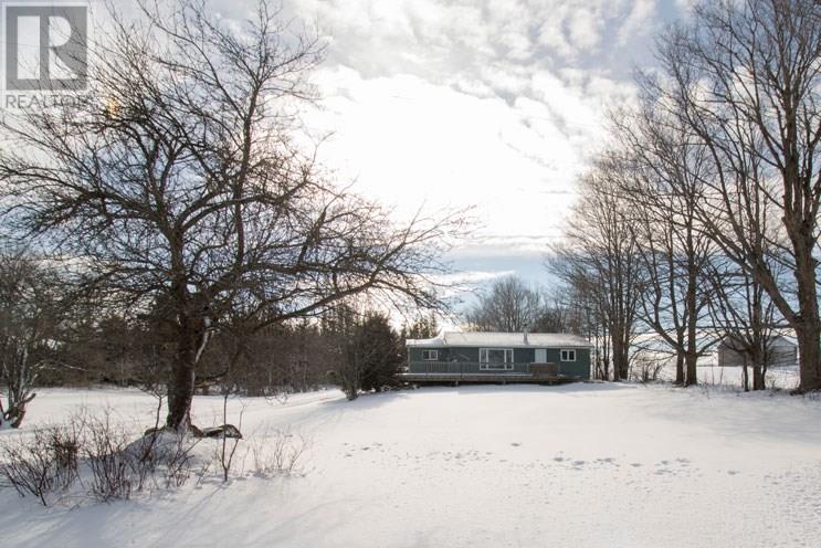 I have plans, oh yes, I have plans. Dreaming is the best part and I'm in no hurry, on no deadline. I'd like to paint the cedar siding, add some (deer-proof!) planting around the deck to disguise the deck footings, But nothing more than that. I am thinking about wool blankets and lanterns and jigsaw puzzles, a vintage steel Coleman cooler filled with drinks on the deck in summer and nights around a fire. Here's a peek at the mudroom: 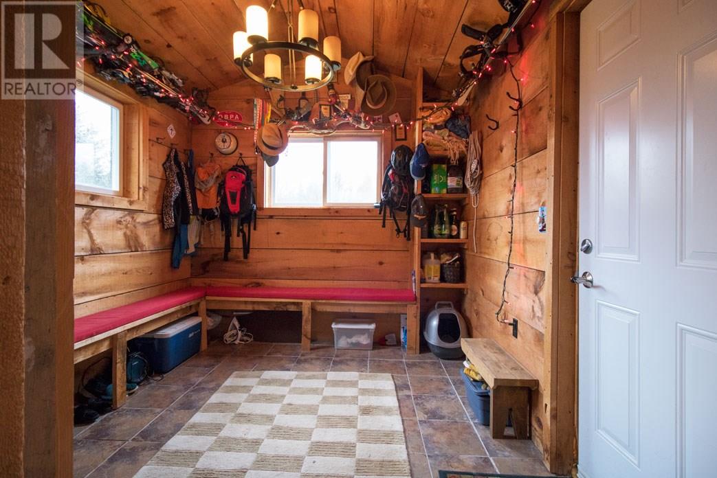 Love.
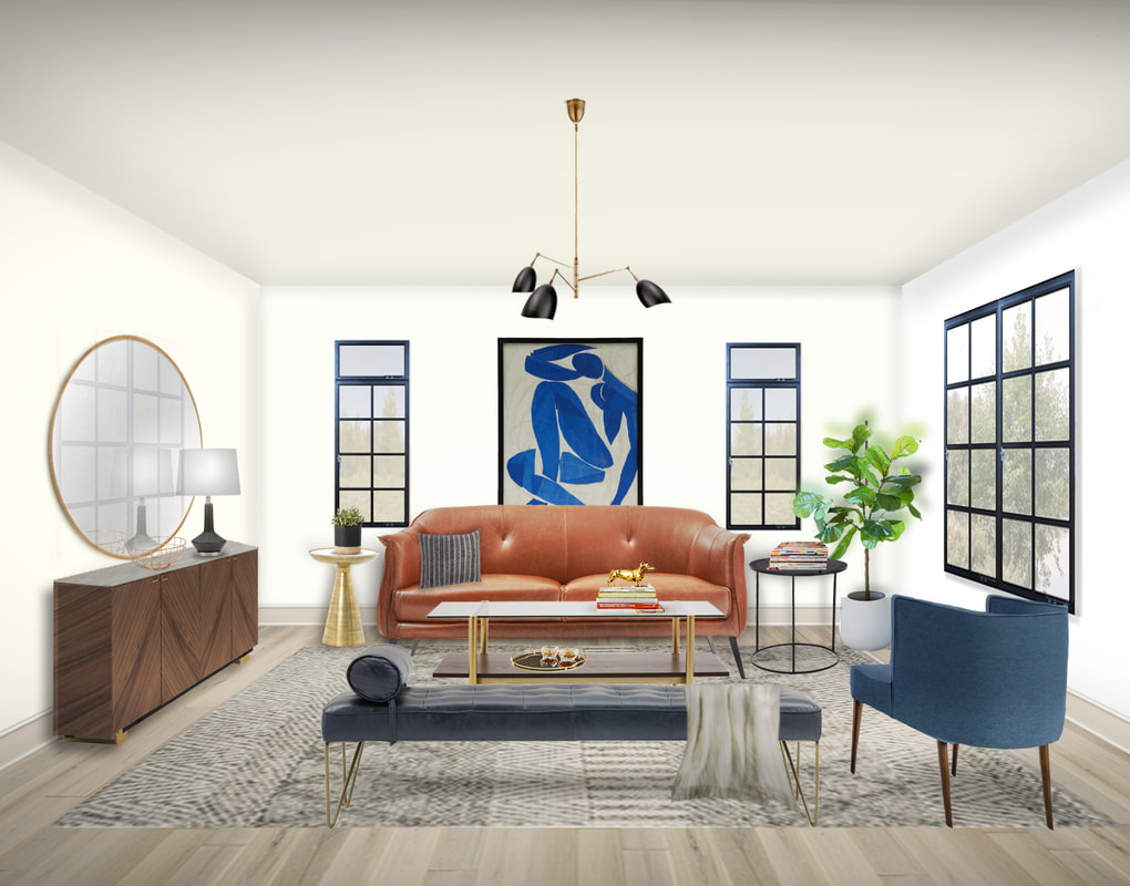 Image source: Nicole Morell Interiors This is my first effort at creating a rendered room design. Normally I present design concepts as individual pieces kind of collaged together in Photoshop, but I wanted to offer next-level visualizing service for those who prefer a little more help in seeing how their room will look.
This room took probably 12 hours of hands-on computer time. Every image has to be sourced, cleaned up, manipulated into perspective (some more successfully than others) before shadows and lighting are added. And those reflections in the mirror and windows! All done by moi. 12 hours per room is not a sustainable business practice, so clearly I have to get much faster and sure-footed before I can actually offer it to clients. But I hope to get there by the new year! |


 RSS Feed