|
I was at a Sherwin Williams/CDECA event today and saw the most lovely, pale wash of robin's egg blue on a ceiling. I came home inspired to look for photos of colourful ceilings. Some designers and paint people refer to the ceiling as the "fifth wall" to remind us that ceilings don't have to be flat, bright white. Let's have a look.
Wrapping the ceiling colour down the wall integrates the paint into the room so nicely. It helps that there seems to be a thin strip of moulding to provide a natural stop, but I think you could try this effect with careful (careful!) taping.
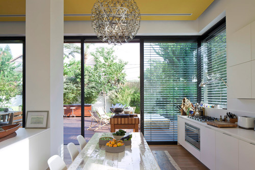
Think how different, how serious, this room would look without that playful yellow ceiling. Brave, but it totally paid off here.
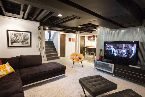
The solution to a jumble of ductwork, bulkheads and venting was to paint the whole thing black. Crazy how good this looks.
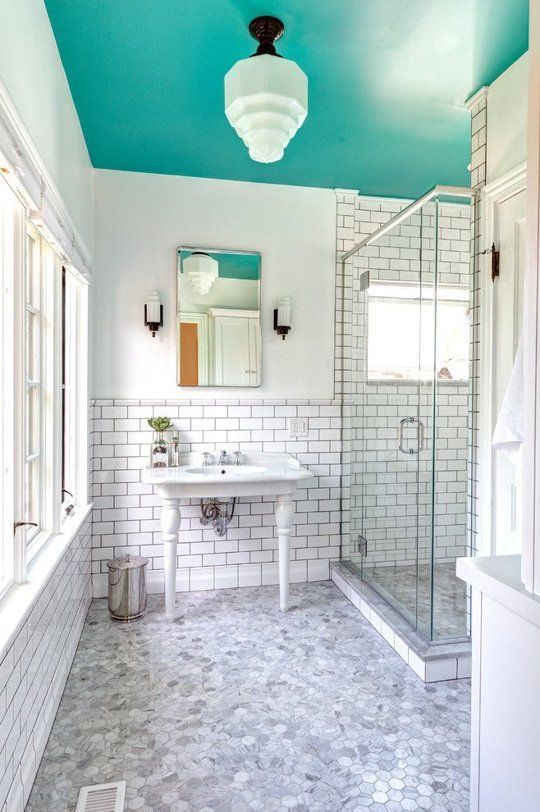
Image via: Pinterest
Right? So so good. Charcoal would look amazing here too. And I'd try a gloss finish!
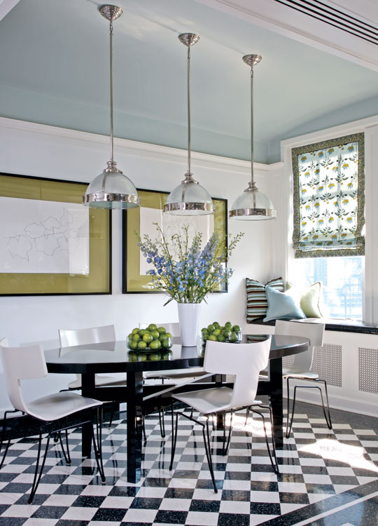
Image via: A Thoughtful Place
Graphic black and white warmed up with a wash of desaturated grey-blue on the ceiling. A skillful colour theorist is in evidence here: the blue of the ceiling is a perfect complement to the faded green mats on the two framed prints. Nice.
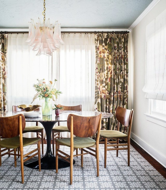
Image via: My Domaine
This might be my favourite. The pattern on the floor and the amazing botanical print on the drapery are enough but someone had the audacity to say "No, we are not done yet. Paint the ceiling." Well played.
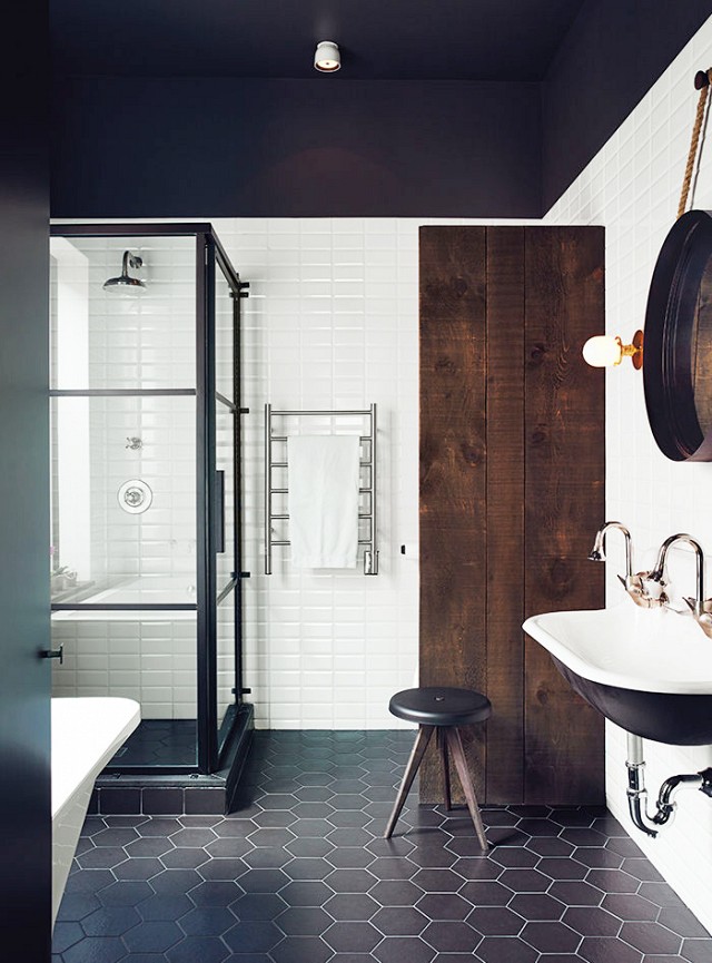
Image via: My Domaine
Ceilings can sometimes feel too tall. Believe it or not some people have these problems. I like the use of black here, not because it makes the room feel smaller or closed in but because dark colours recede, light colours advance. I find the dark ceiling here difficult to delineate, it's challenging to see where it ends, and that gives it a cozier feeling. It's also a nice, warm black. Just as whites come in a bunch of variations so too does black. Check the undertones by lining up paint chips close together.
0 Comments
Leave a Reply. |
 RSS Feed